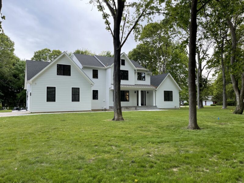
As an architect I like to drive around to see what’s happening with new houses and renovations on the East End landscape, aka the architectural playing fields.
This is something of a hobby for architects and sometimes we are pleasantly surprised, bored, or even disheartened. However, these jaunts do give us a feeling about current trends and what can be done sometimes to ameliorate unintended consequences.
The siting of houses, at least along the coastlines including ocean, bays and creeks is governed by regulations developed by FEMA, the Federal Emergency Management Agency. The changes made to the base flood plane elevation maps over 10 years ago were the result of the severe damage caused by flooding from multiple hurricanes. Consequently, the look of waterfront houses and their properties is changing dramatically on the East End.
On the oceanfront’s strictest FEMA zone in Southampton, for example, the first-floor level in new and raised houses is required to be 13 feet above sea level. Along bays and creeks, the elevation levels are lower, but they can vary depending on zone location according to the FEMA maps. To satisfy these elevation requirements, cubic yards of fill in endless quantities are brought to sites and bermed up in a straight line to entry level. This is done so these houses don’t look like circus acts on stilts. The result is a house sitting on a man-made mound (or should I say a throne).
It’s odd to see so few of these houses integrated into the natural landscape, which could be done by shaping the berms around the house or creating tiered terraces at different grades as part of an approach to the structure. This solution could lower the scale of the home while enhancing the landscape surrounding it. Addressing the landscape could also prevent the raised house from looking as if it is going to devour the smaller neighbor next door that sits on its original foundation at natural grade. Mound houses are an easy solution but most of them look bizarrely placed on their sites.
As for houses being built and/or renovated there is one phenomenon that has become prevalent in the last 15 years — the ubiquitous white house with black door and window frames and roofing made of black, fiberglass shingles or standing seem metal all with prepainted white cement fiber or cellular composite (PVC) siding. When I asked one of my clients why she liked this look so much she said, “It’s clean and really sleek.”
These houses are all the same street after street. This trendy veneer can be found on every style of house — farmhouse chic, Shingle Style redux, born again Post Modern (as if once wasn’t enough), McMansion facelifts, Arts and Crafts bungalows, and even Queen Anne, which has succumbed to the black metal sash craze with square muntins. Why, how, and when will it all end?
The why has to do with trends. For instance, avocado green and harvest gold appliances were all the rage in the 1960s through the early 1970s. In the 1980s stainless steel became popular and has remained the predominant appliance facing material to this day, although colored, tempered glass facings are gaining strength in the marketplace. Trends are cyclical and can last 15 to 20 years or more before the public grows weary and the next great thing comes on the market.
The idea that these houses are all wearing the same uniform is nothing new. There is a certain safety net with conformity versus building something very original that isn’t necessarily everyone’s cup of tea. The materials specified for the exterior on these black and white houses have resilience benefits by requiring little maintenance, which is always a plus. A new trend cycle is also good for the real estate business, building product manufacturers, builders, subcontractors, the home goods and furnishing markets. With the arrival of this new aesthetic, also championed by home and interior design magazines, Aunt Mary’s hutch and grandma’s sterling tea service don’t seem appropriate anymore, although George Jensen may still be given a pass.
The recycling trend of white houses with black frame windows, doors and roofs, which is really a social manifestation, started in the aughts and will probably continue through the twenties unabated until these structures start to look dated, or portents signal inevitable change.
Anne Surchin is an East End architect and writer, vice chair of the Southold Historic Preservation Commission and co-author with Gary Lawrance of “Houses of the Hamptons 1880-1930.”