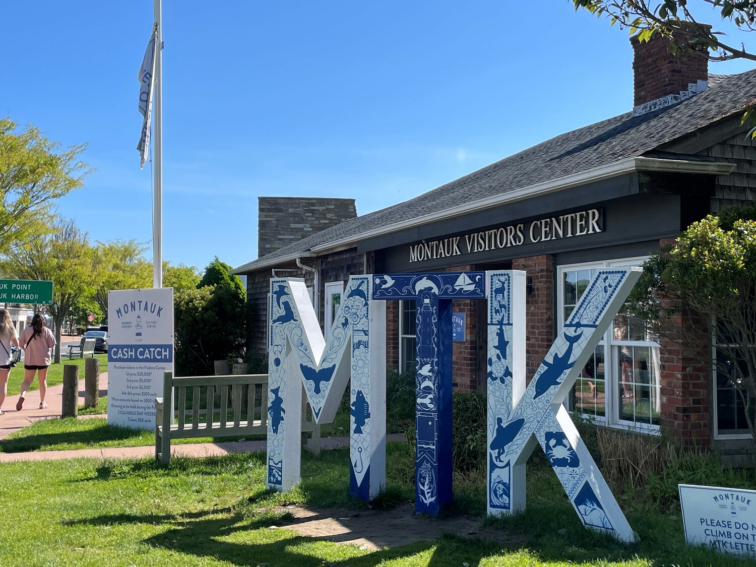
Sarah Schreck first came out to Montauk in the dead of winter a few years ago, which may seem like an odd time to visit given the lack of activity in the off season. But since that first trip, she has developed a great appreciation for the hamlet through frequent visits with her partner Jack, whose family owns a home in Montauk.
“I’ve been the luckiest person in the world to be able to spend so many months out of the year in Montauk and I wish more honestly,” she said. “So in that spirit, I’m trying to be out there as much as I can.”
And in that spirit of wanting to be in Montauk, Schreck, a New Haven-based artist, recently completed the 2024 design of the MTK sign located outside of the Montauk Visitors Center right in the heart of the hamlet.
Every year, the Montauk Chamber of Commerce, whose office is located at the visitors center, holds a competition where it accepts designs from local artists and selects one to put on the MTK sign for the summer. This year, the chamber received 15 applications, but the intricacies and amount of detail in Schreck’s design resonated most with the review board.
“This year with Sarah, it was very obvious that what spoke to them is how many different Montauk treasures she was able to sneak into just one beautiful design,” said Mariah Miltier, the chamber’s executive director.
Based in a blue and white color scheme, Schreck’s design features numerous silhouettes of wildlife like dolphins, turtles and deer, natural scenes including beaches and waves, fishing hooks and poles, popular seafood catches like lobsters and black sea bass and the iconic Montauk Lighthouse right in the middle of the design. She said that the loaded design reflects her “eagerness to fill it all” with everything that she has experienced in her time in Montauk.
“Trying to fit everything I could onto the sign represents all those many different things that I see while I’m out here in the short time that I can,” said Schreck.
She was inspired to do this type of design by a piece done by Jess Lamwerth, an artist whom Schreck used to live with in Pittsburgh, that incorporated many details about a town into a small space. Though she had never done a design like this before, she said that she liked the idea of incorporating many different symbols under an overarching idea.
“I loved this arty thing that I had seen, but haven’t done before,” she said. “Incorporating a lot of designs, a lot of patterns that look organic, but also have a uniformity to them.”
Schreck said she put a lot of research into Montauk’s history, native plants and animals in order to capture the overall essence of Montauk and not just make it a reflection of her experiences. She said that she wanted to make sure to capture both the natural elements of Montauk and its status as a tourist town.
“I was trying to pay homage to natural stuff with the organic shapes and subjects,” she explained. “But also, Montauk is big for tourism and the food there is always incredible, so I wanted to figure out how to do a nod to that on the sign.”
The element of the design that stands out most to Schreck are the elements that evoke the night sky and dark nights of Montauk.
“The thing I was really happy to integrate through the design are stars,” she said. “That’s definitely one of the most breathtaking things about the area — going out at night and looking at the sky and the lack of light pollution.”
With all the different features of Schreck’s design, people can look at the sign multiple times and notice things they didn’t pick up on before. Even Miltier, whose office is in the visitor center building, still notices new aspects.
“I’m in the office five to seven days a week and I keep walking past and noticing more stuff that I didn’t notice initially,” said Miltier. “So it’s fun for us in house.”
Miltier said that the sign symbolizes the duality of Montauk as a vibrant and supportive year-round community for locals and a welcoming community for any and all visitors of the town.
“The MTK sign in my mind brings the two together where it’s supporting locals and what makes Montauk so special on a day-to-day basis, as well as welcoming and inviting the visitors that make Montauk so special when they’re here,” she said.
Miltier also expressed how happy she was getting to work with Schreck on the project and said that she hopes that the chamber will continue to collaborate with her.
“Sarah was such a treat to work with,” she said. “She’s so bubbly and brought this amazing energy to the experience that we all here in the office were saying ‘How can we get Sarah to come work for us?’”
Schreck echoed Miltier’s sentiments by expressing her gratitude for getting to share her design with the community and that the chamber made the opportunity available to the community.
“I’m overwhelmed with gratitude that this is something that the chamber has offered and that this contest is something that’s available to folks,” she said with a smile. “I think it’s such a charming and lovely community-oriented idea.”
Schreck’s design will grace the MTK design until May 2025, at which point, another artist will be selected to create the next design for the sign. For more information on the Montauk Chamber of Commerce, visit montaukchamber.com.